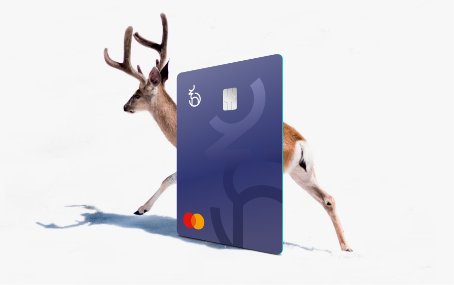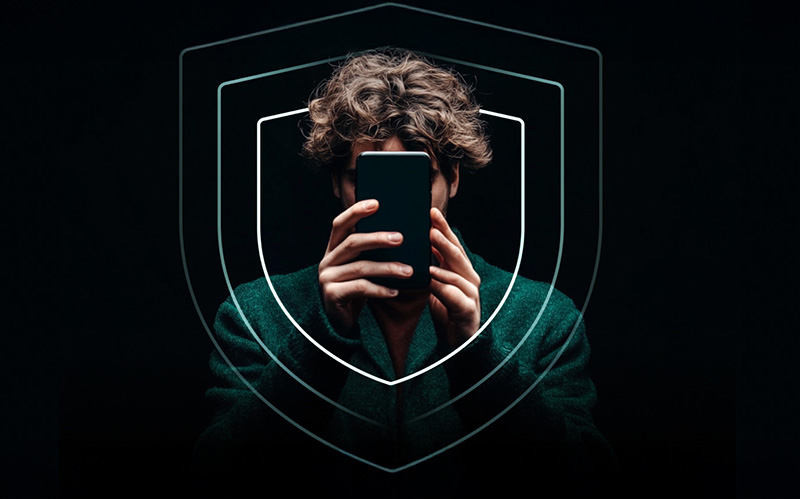


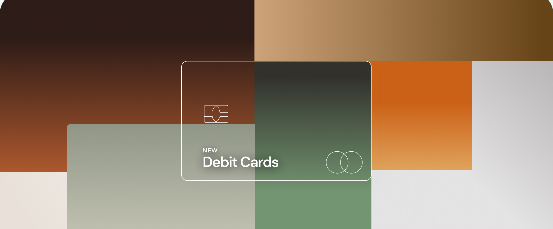
Introducing the new FINCI debit cards designed to make you feel something
There are roughly 30 billion payment cards in circulation worldwide. Most of them look almost identical. Change the logo and the colour and it could be any company.
And most people don’t give their debit card a second thought. They pay with it, it works, and that’s the end of the relationship. It’s purely functional. But we think that’s a missed opportunity.
The one physical thing we give you
"'Finance is an industry built mostly on invisible systems. As a customer, you don’t see the infrastructure that makes it possible for your money to move around the world in seconds. So the debit card is one of the very few things we ever physically put in a customer's hand. That felt like it deserved more thought than the industry usually gives it."
Witold Wilczynski, Marketing Director, FINCI
You see your debit card sometimes multiple times a day. You touch it, you feel it, you carry it with you everywhere. For digital wallets, you’re flashing it every time you hold your phone to the card reader. And either physical or digital, you know people in the queue behind you will have a sneaky peek over your shoulder to see what card you’re using.
So we thought, why not make your debit card look good?
A little piece of art in your wallet
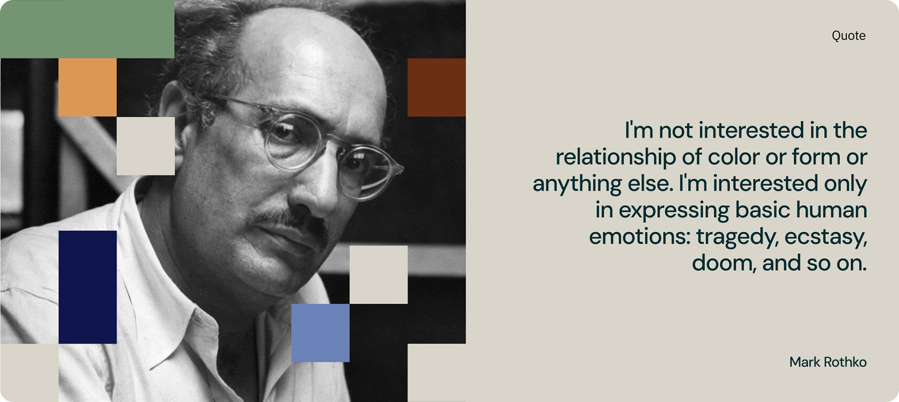
Mark Rothko was an American painter who spent his career testing one idea: that colour alone, without figures or narrative, could express something fundamental about human emotion. His paintings are fields of colour, nothing else. Stand in front of one and you'll understand what he meant. There's nothing to decode, but there's something to feel. His own words put it plainly:
"'I'm not interested in the relationship of color or form or anything else. I'm interested only in expressing basic human emotions: tragedy, ecstasy, doom, and so on." Mark Rothko
That got us thinking. So instead of asking what our cards should look like, we asked what they should feel like. Then we went looking for the right visual language to answer that.
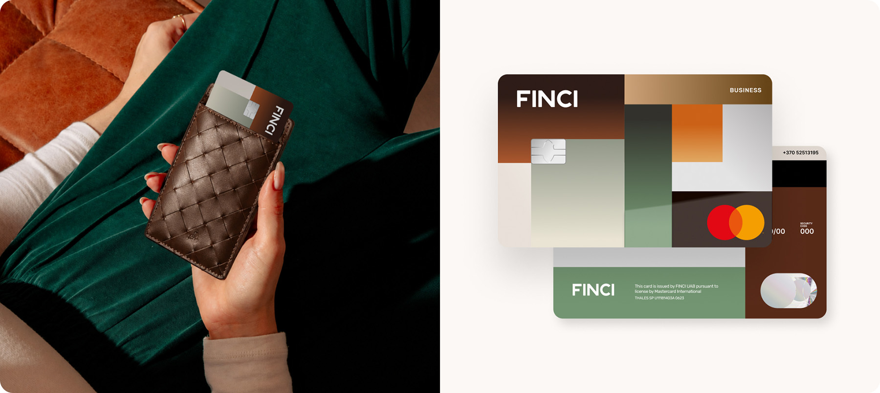
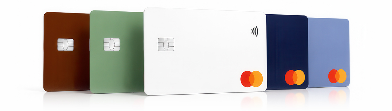
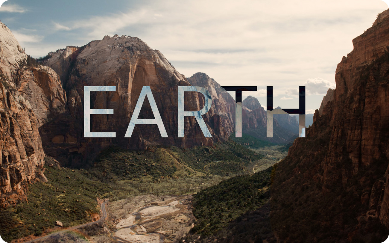
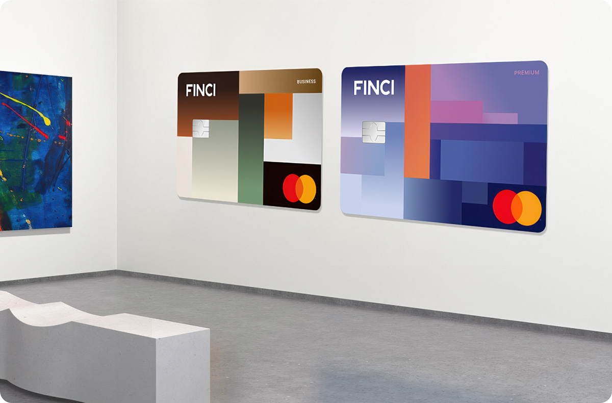
Introducing EARTH for FINCI business customers
The business card draws its colour palette from ancient landscape, the deep browns, burnt oranges and muted greens of rock and soil accumulated over millions of years. It's a design rooted in permanence and the value of something built layer by layer over time, which feels like the right sentiment for business owners focused on stable, lasting growth.
And while the goal is for the card to be felt, it’s also meant to be seen. Different sections carry different finishes, some matte, some gloss, so the composition shifts as the light catches it. It's a level of craft that most cards never bother with.
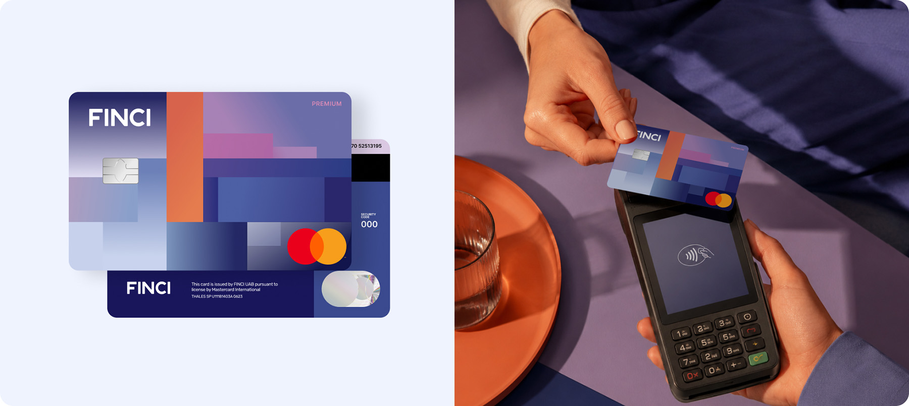
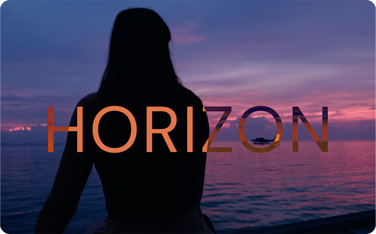
Introducing HORIZON for FINCI Premium customers
The individual card captures a specific moment most people have experienced: the point where sunlight meets the ocean as the day ends, when the light does something extraordinary and everything briefly goes quiet. The colours move from warm oranges and pinks into deep blues and purples, taken from a painting that captures exactly that moment.
It's a peaceful image, but not a passive one. A horizon is where you're headed, not where you've been, and that felt like the right sentiment for a card carried by people getting on with their busy lives.
Like EARTH, the finishes are part of the design. The way different areas catch the light is intentional, making the card look slightly different depending on how you're holding it, another small detail that separates it from a standard debit card.
Choosing colours that move you
You might notice these cards don't use our brand colours. That was a deliberate choice. Colour is only one part of what connects people to a brand. Ferrari isn't iconic because of red, it's iconic because of what that red makes you feel in that context. We chose colours that serve the emotion and purpose of each card rather than forcing the design into a brand guideline. The connection to our brand is still there, it’s just expressed differently.
Why we put the work in
We know a debit card isn’t going to change your life. But we do believe that objects people interact with every day are worth designing with care. So if even once in a while someone reaches for their card and feels something – a brief moment of calm, or a small sense of pride in what they're building – then the extra thought was worth it.
And let’s be honest, we’re nearing the end of the physical bank card era. People are using digital payment methods more and more. And it’s much rarer to need cash, so we don’t visit the ATM so much. Plus, the environmental impact of plastic cards is significant, which is why we issue digital cards as standard and physical cards must be requested. So why not enjoy the final years of these little pieces of plastic with a little style?
Stay tuned for updates, both cards will be available this summer.